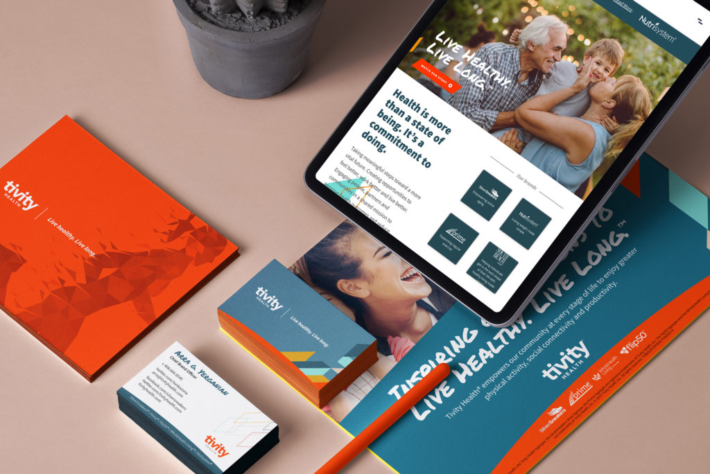
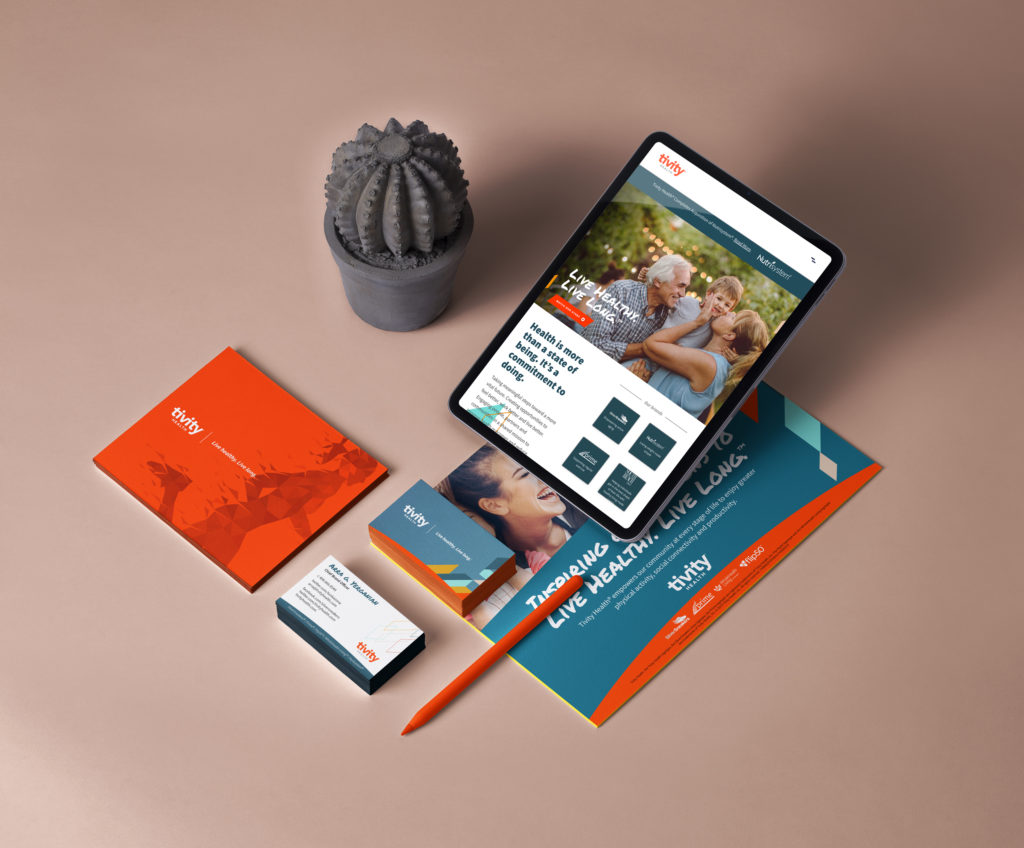
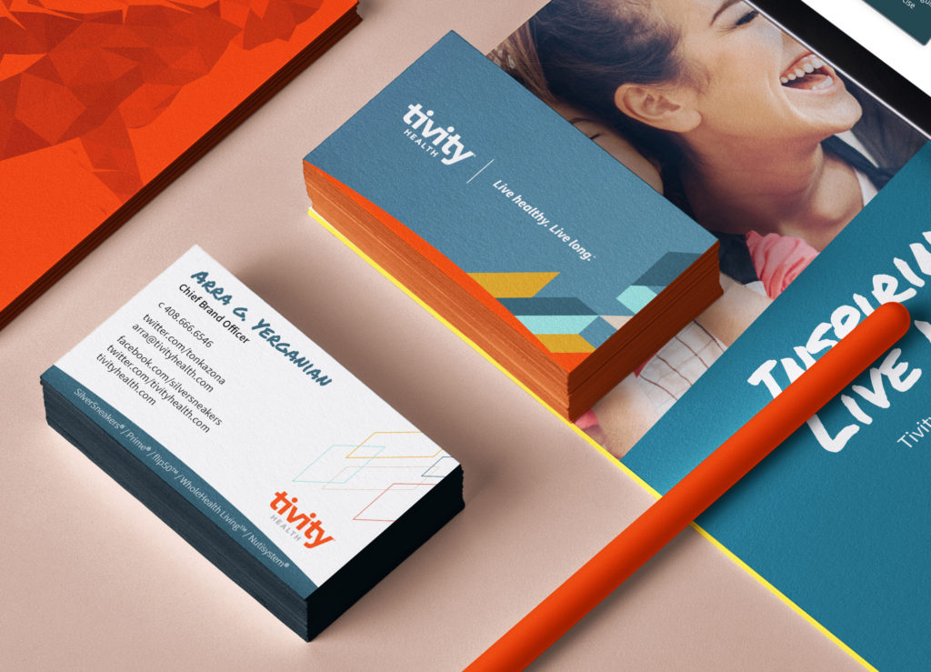
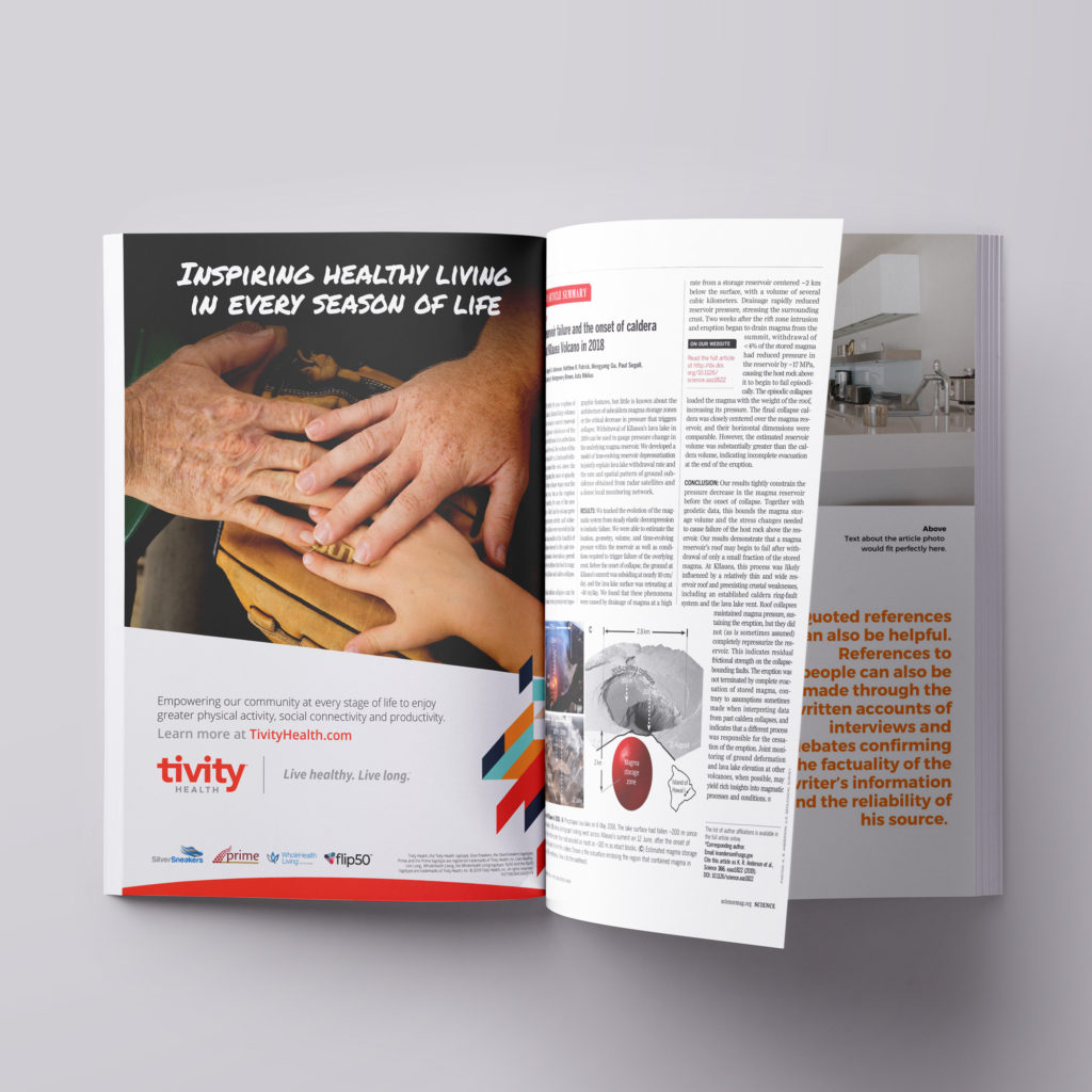
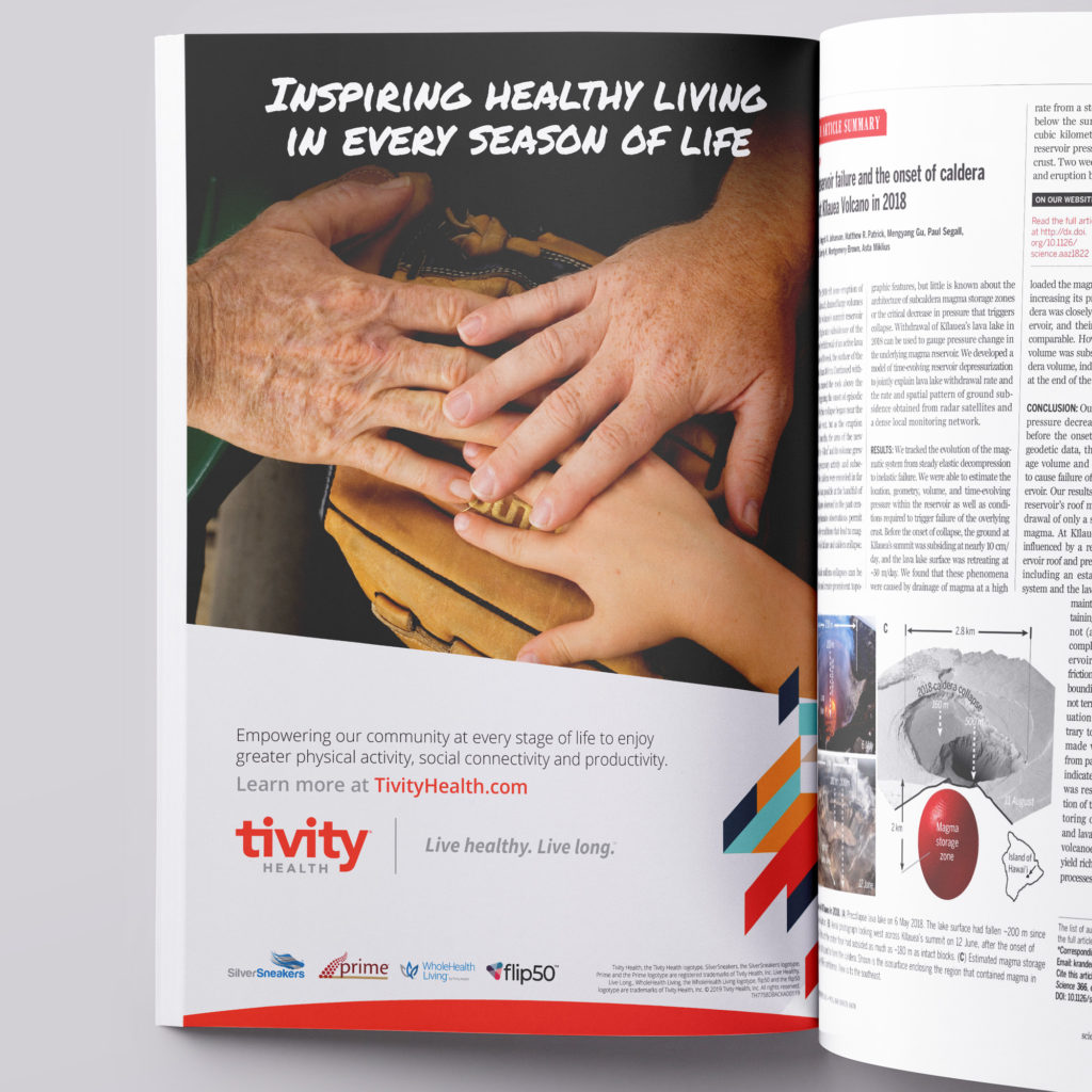
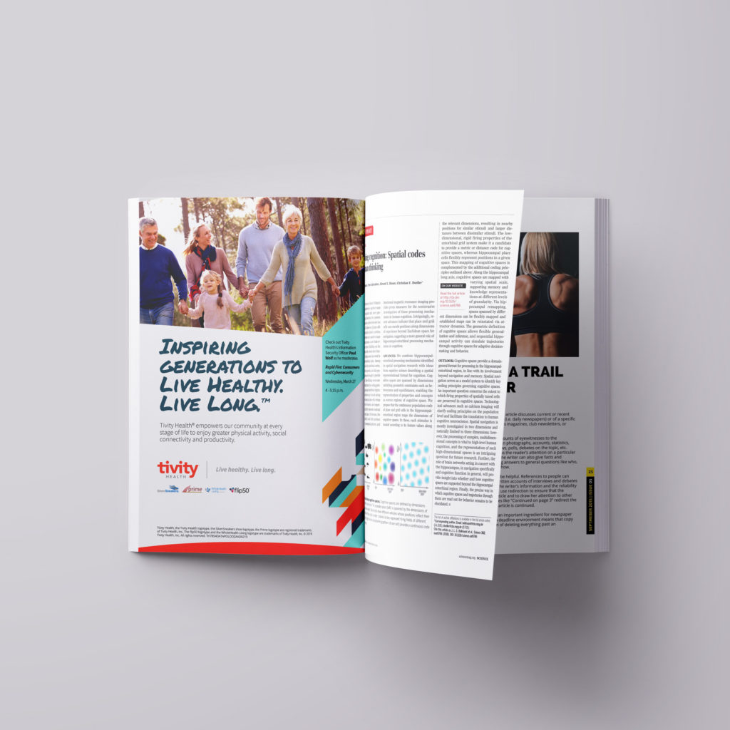
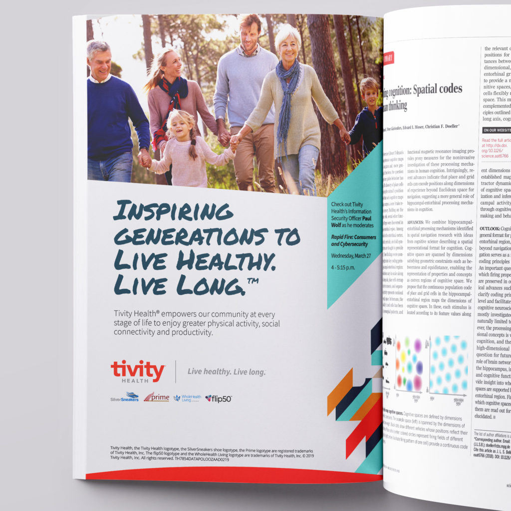
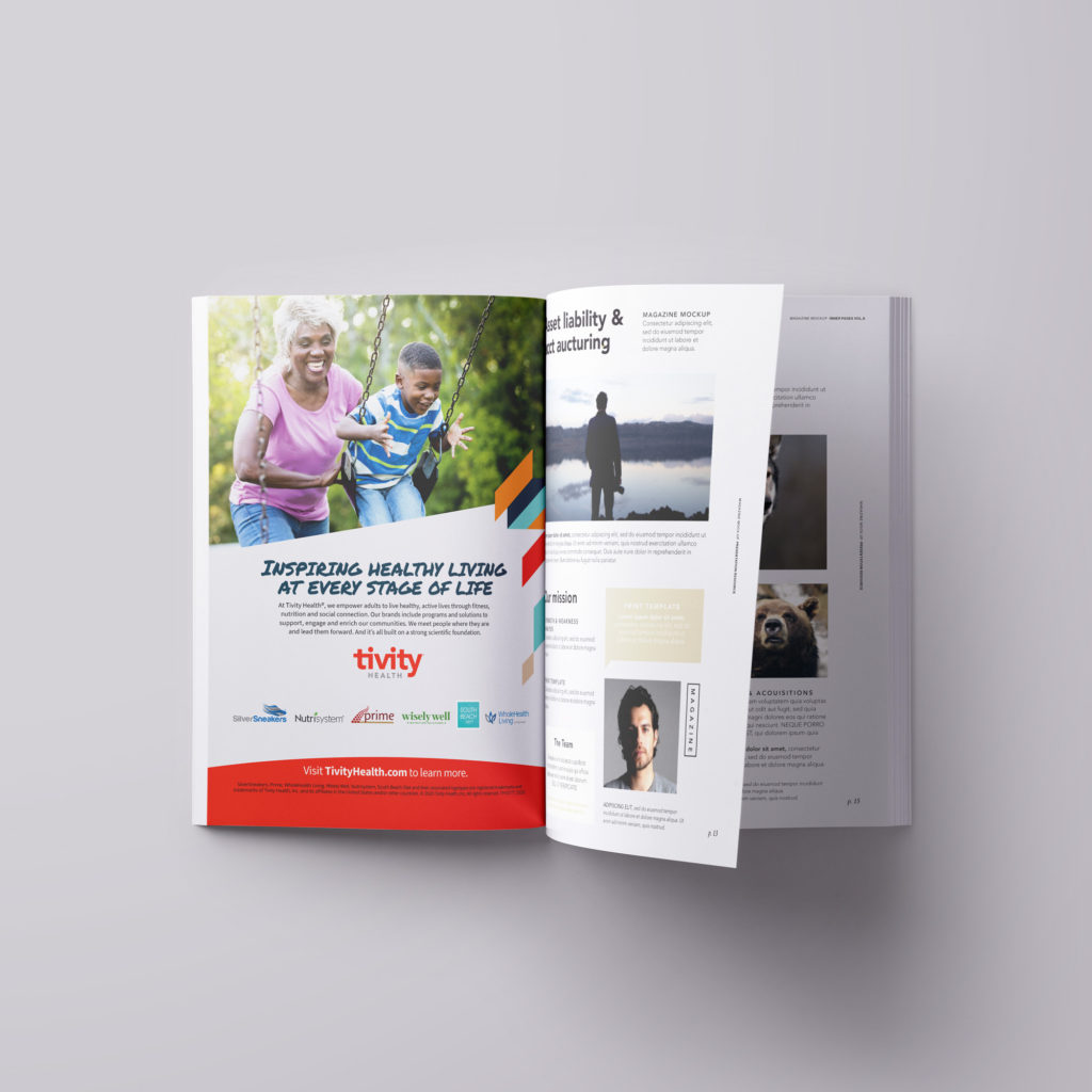
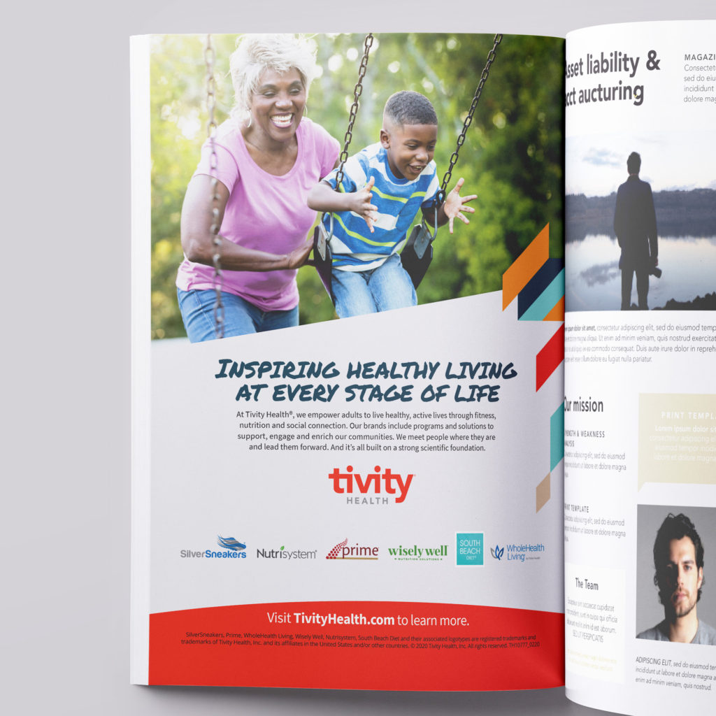
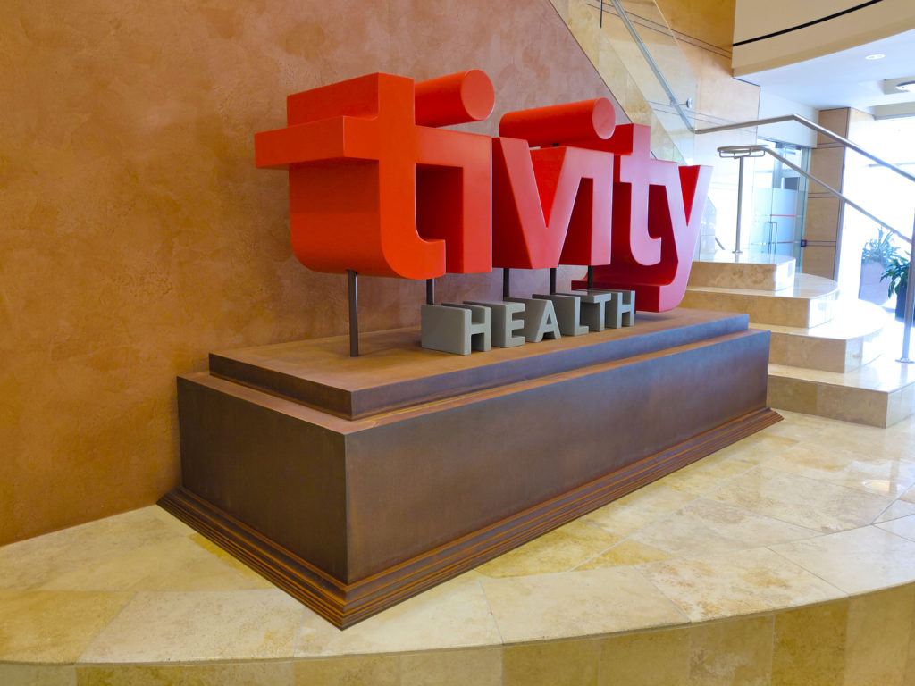
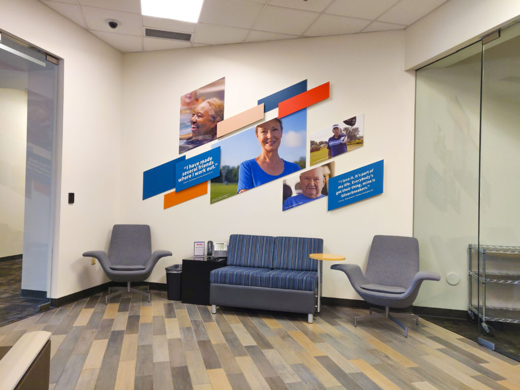
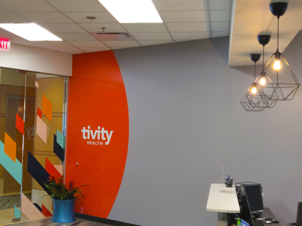
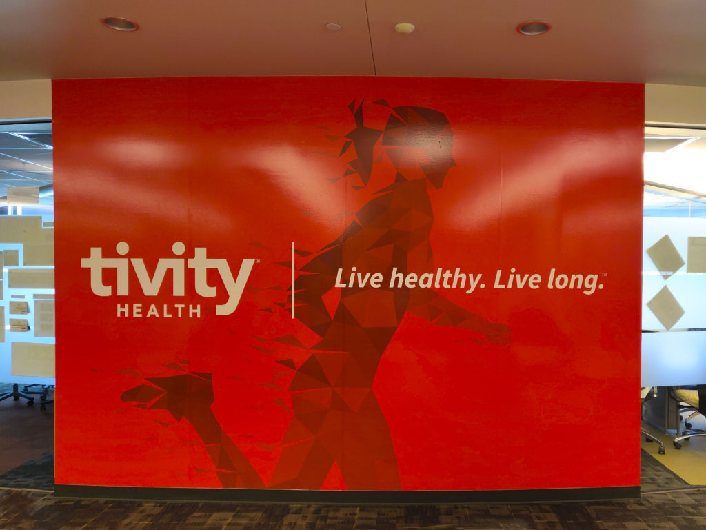
This project was an “evolution”, not a rebrand. Tivity Health® is still in its infancy, and even though we are a publicly traded company with a Board of Directors and layers of leadership, we weren’t afraid to dig deep and realize the visual brand needed evolved…it needed to represent something more than it did in 2016 when Prophet developed the inaugural brand.
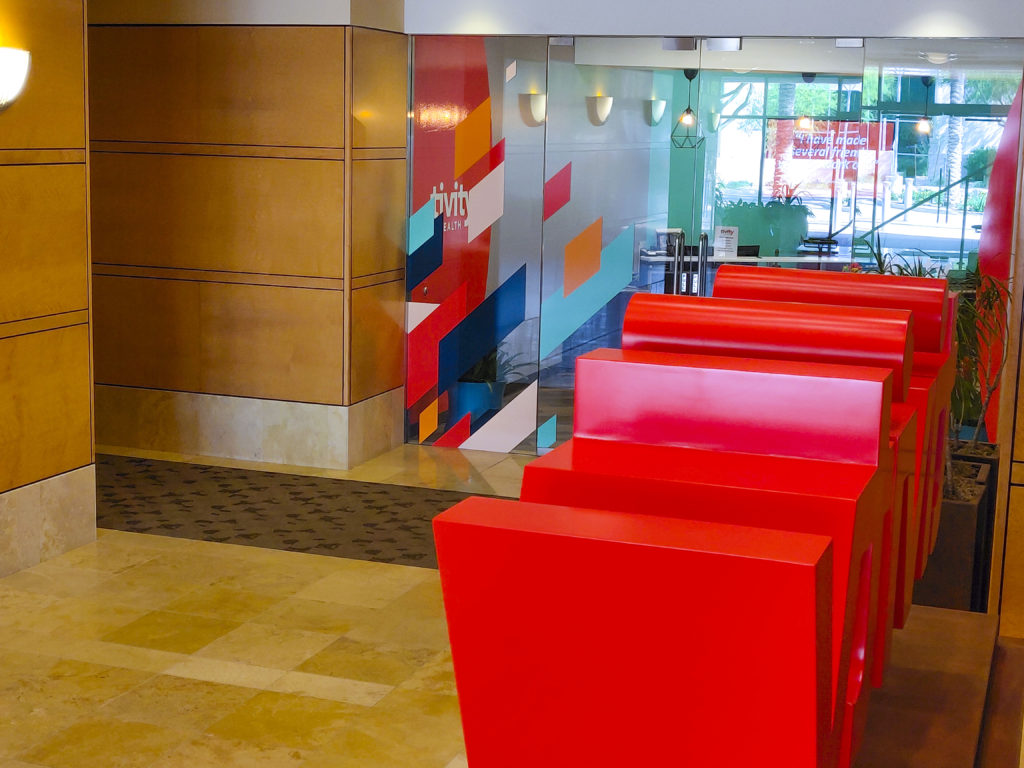
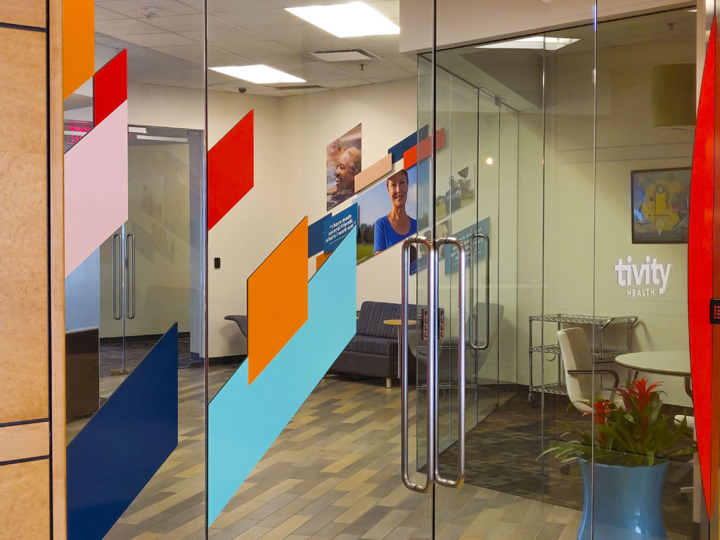
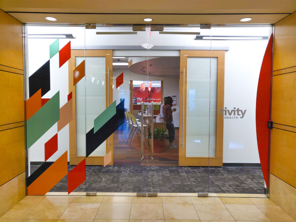
We wanted the visual identify to reflect where the company was headed. One of the biggest known objectives was to make it more unique and we needed to weave in more “motion”. It needed to be more human, less stark and lastly, it needed to break out from only utilizing the R’Orange color swatch to define the brand. Some key updates were the introduction to the “slant” graphics (motion/active), a handwritten font (human) and converting from a sterile white and “R’Orange” (corporate color) to one that invites the navy’s, tan’s, etc.
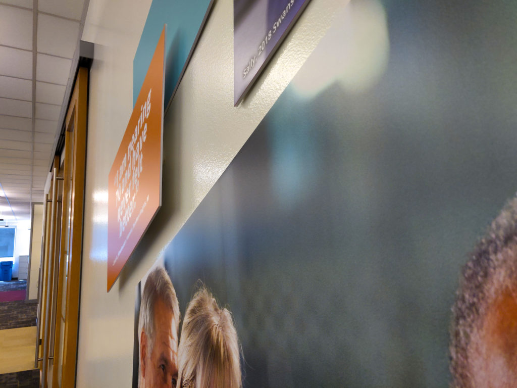
Beyond the public facing identity, we also enhanced the campus identity to reflect the evolution, colleague screensavers, shirts, etc.
© Tivity Health
- Campaign Concept
- Concept Approval
- Concepting
- Creative Direction
- Design
- Storyboard
