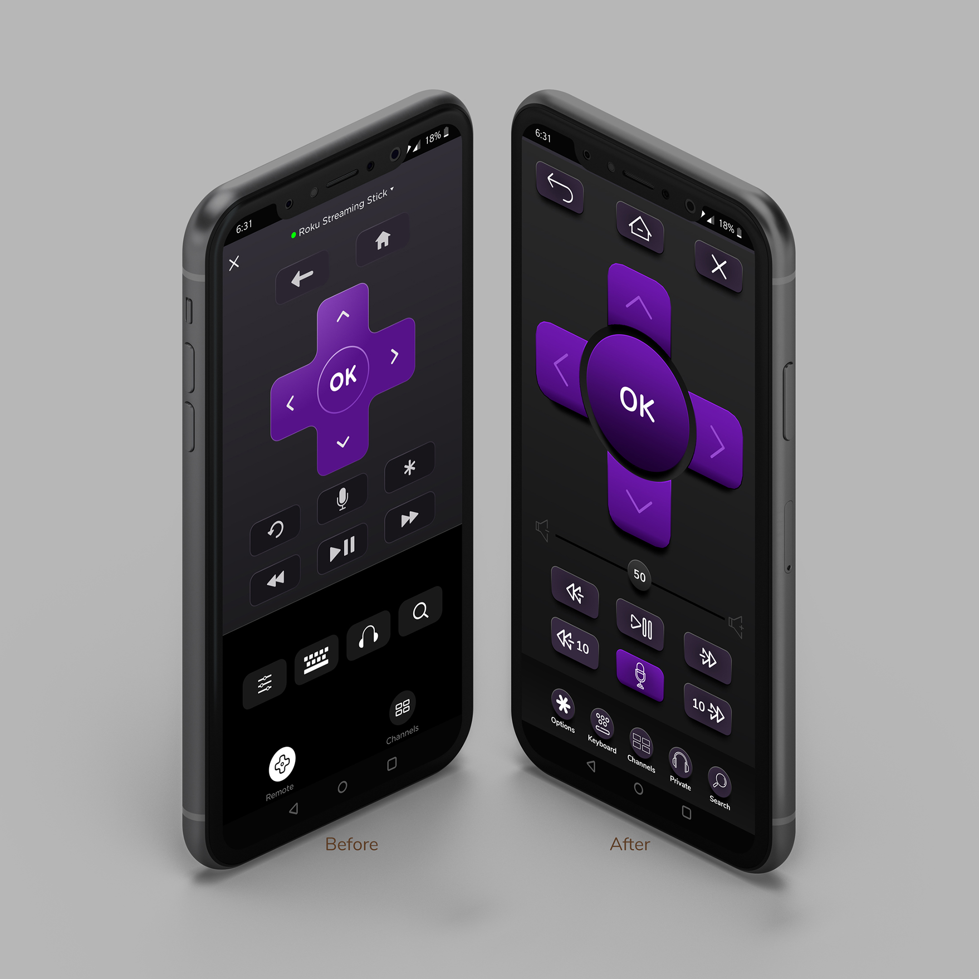
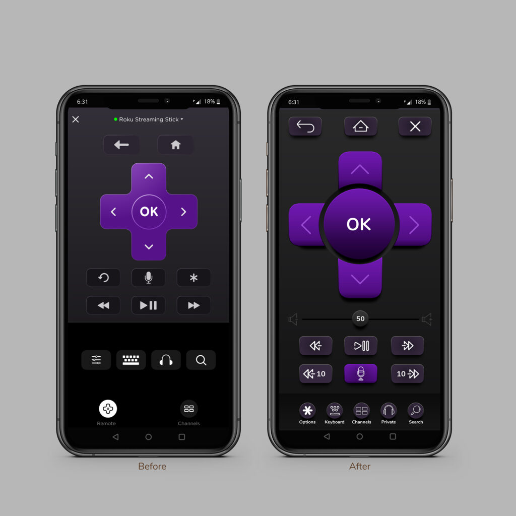
I’ve used Roku for nearly 10 years and every time I get a new unit, my family looses the remote. The factory remotes cost about $30 to replace and thankfully, their free phone is very useful with features even their physical remote can’t do. Unfortunately for me, their latest design update is lackluster. Instead of being a disappointed consumer, I designed a new experience based on my usage and wishlist and submitted it to Roku for consideration 😉
My Changes:
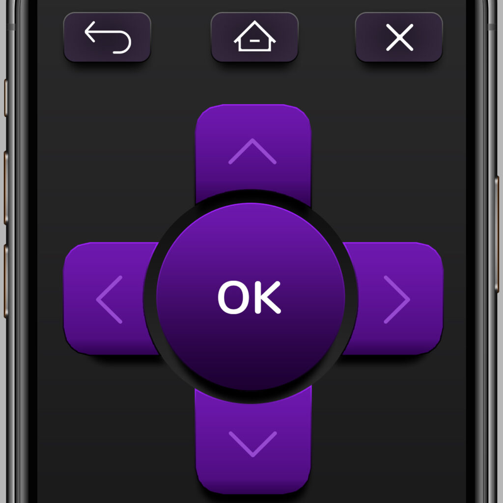
+ Significantly larger D-Pad for more accurate response
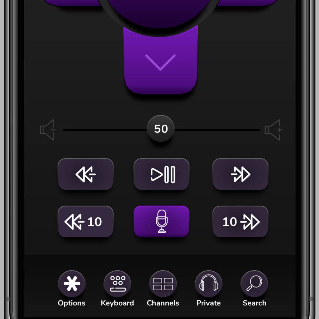
+ Added 10 sec Rewind and Fast Forward
+ New brandable icons
+ Rearranged buttons to match my habits
+ Lowered the in-video buttons lower for easier one-hand access
+ Added volume control
+ Emphasized the mic button (seriously under-appreciated feature)
+ Back, home and close buttons are symmetrical
+ Added visual depth
+ Made use of negative space
- Campaign Concept
- Concept Approval
- Concepting
- Creative Direction
- Designer
- Executive Approval
- Storyboard


