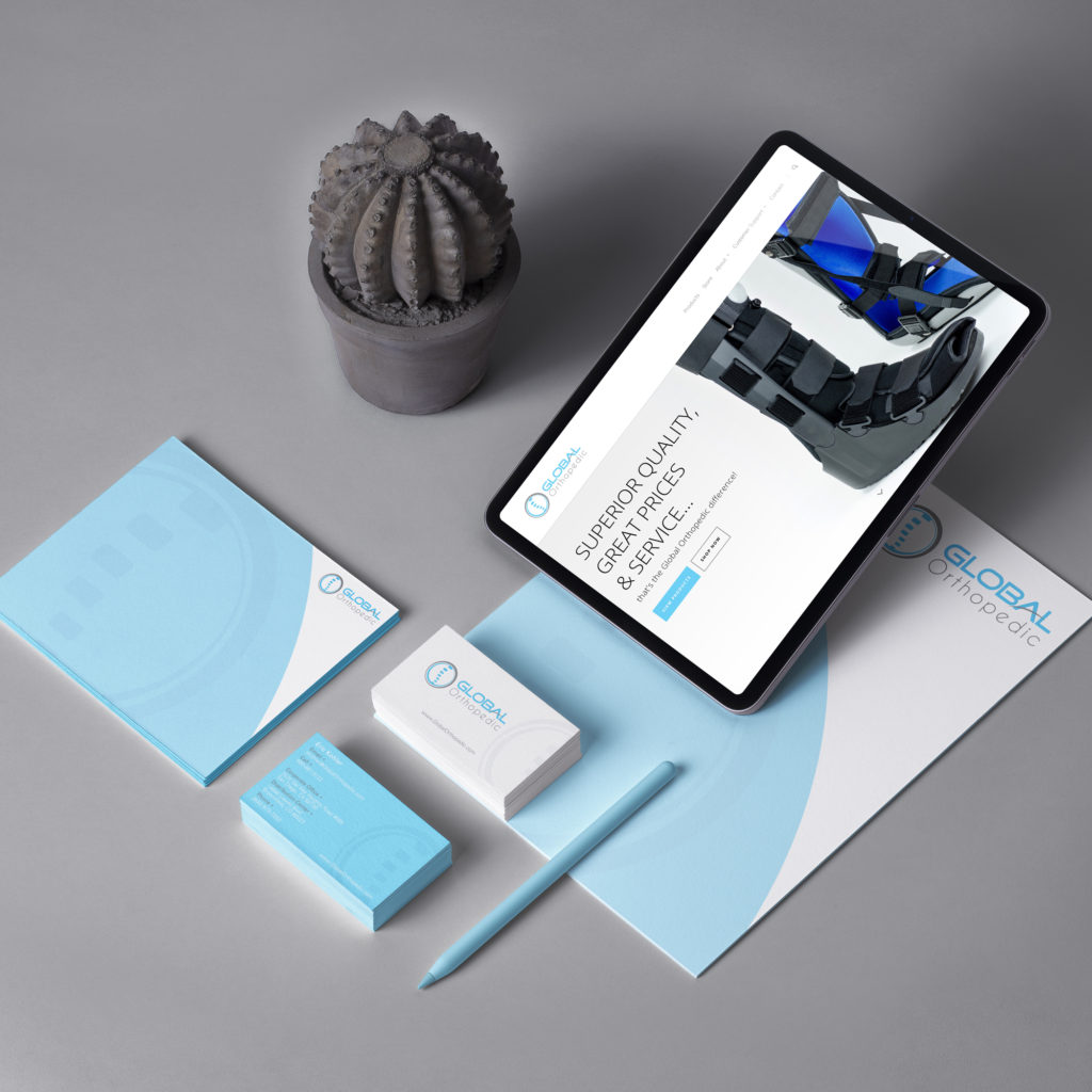
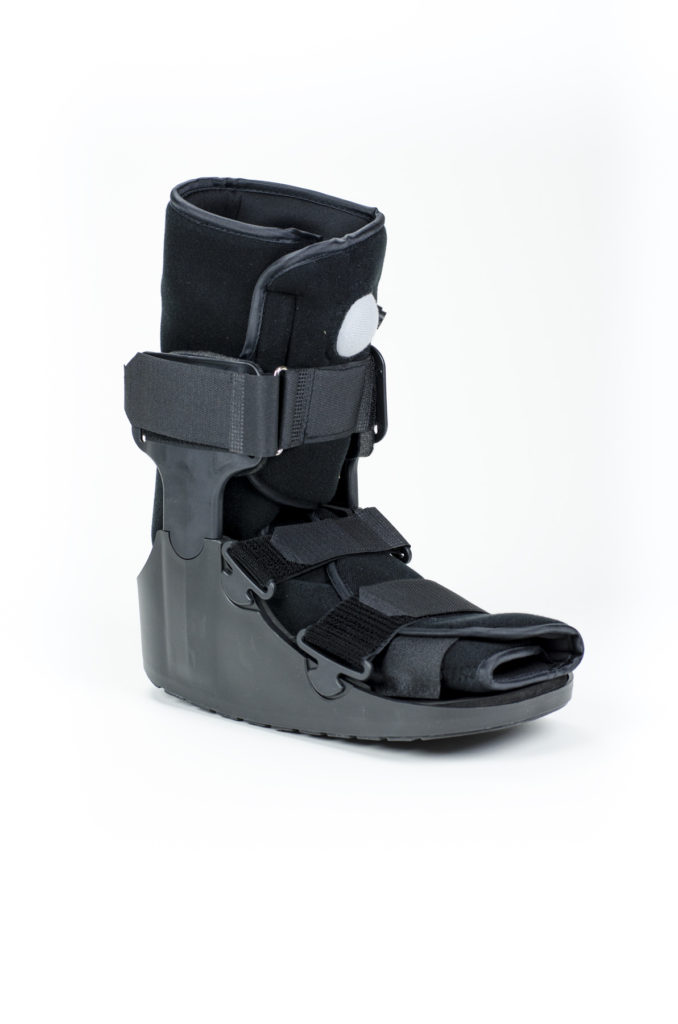
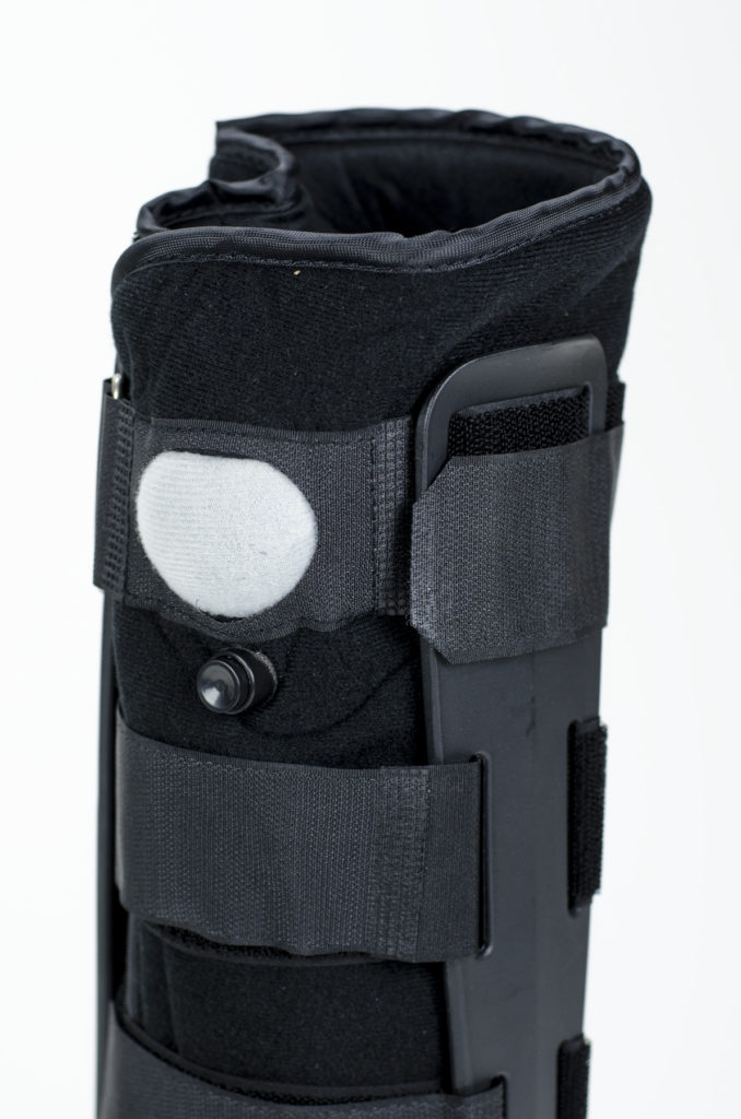
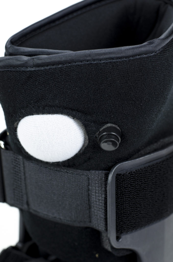
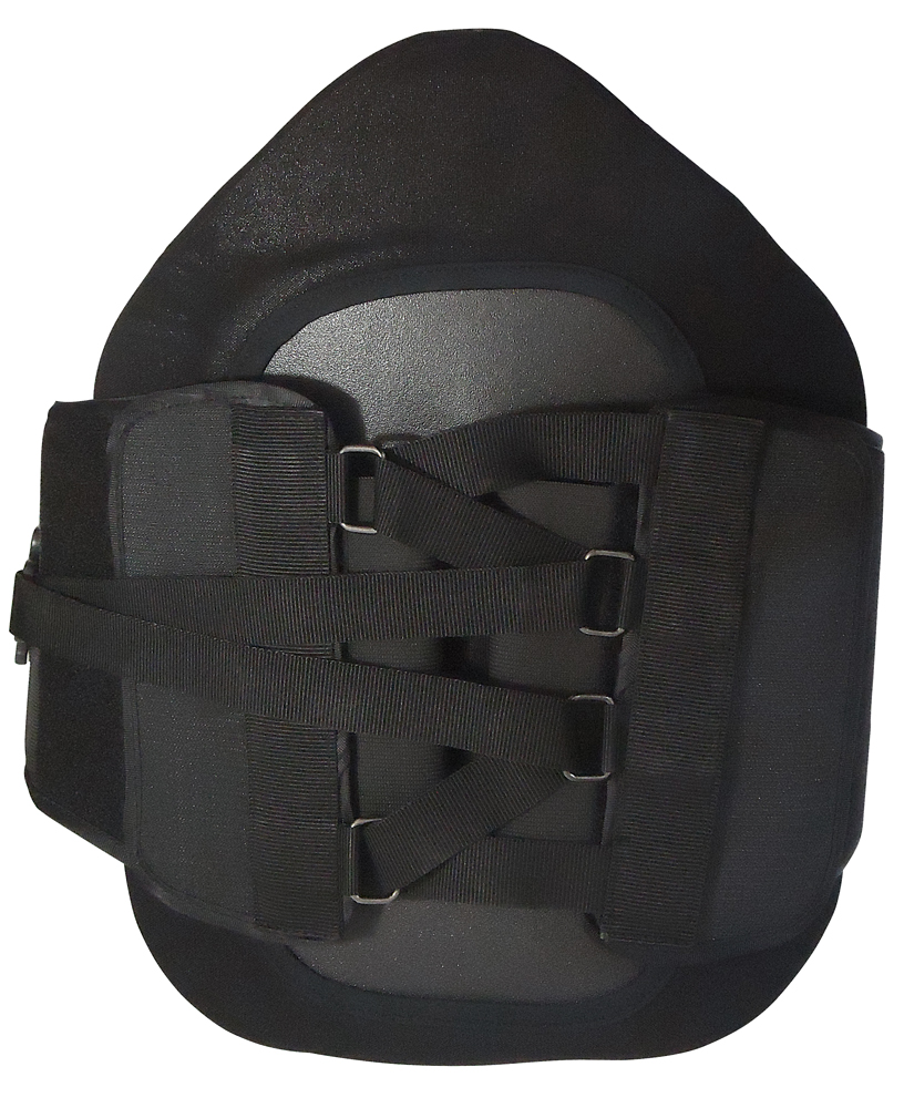
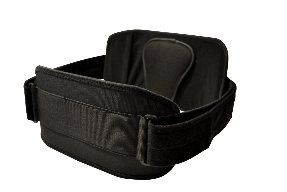
Global Orthopedic was a startup and needed a completed brand identity and studio photography of their products. The visual brands’s goal was simple, yet it needed to instantly inform the audience what industry they solve problems for…without being too literal. The abstract spine and simple text treatment to the “A” are sometimes all it takes to stand out and look professional. Their initial thought was to have a caduceus in the logo, the common medical snake symbol, but I am glad they allowed my creative samples to trump their preconceived thoughts.
The colors were a sky blue and gray palette and we decided to not have additional colors appear in the brand expression.
Deliverables:
+ Company Logo
+ Product Logos
+ Corporate Identity
+ WordPress Design
+ WordPress Development
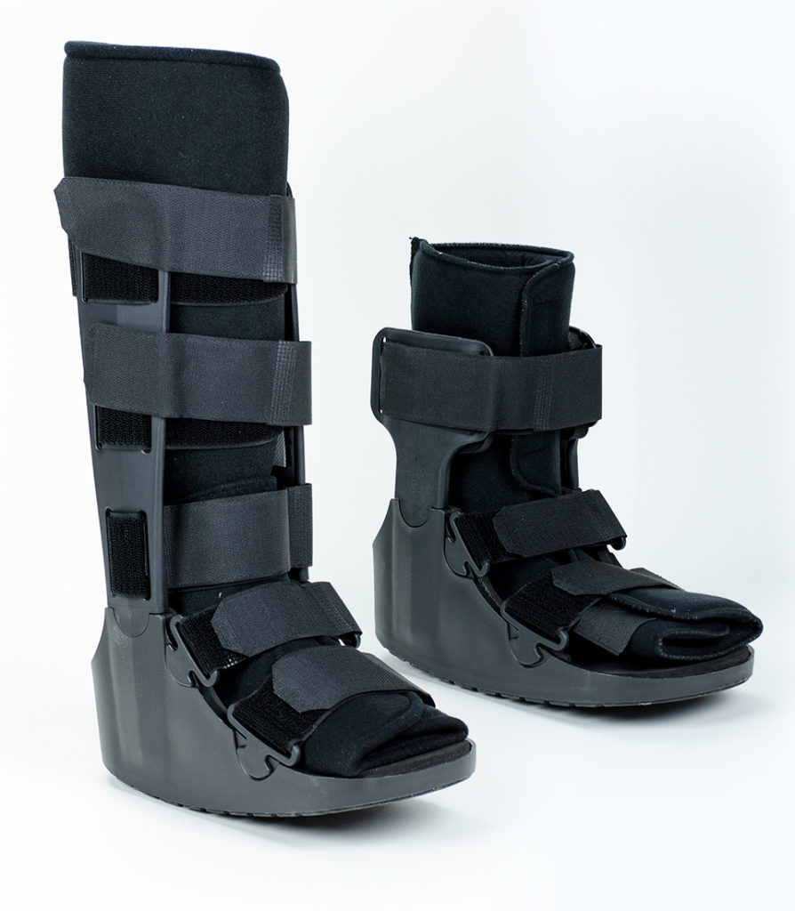
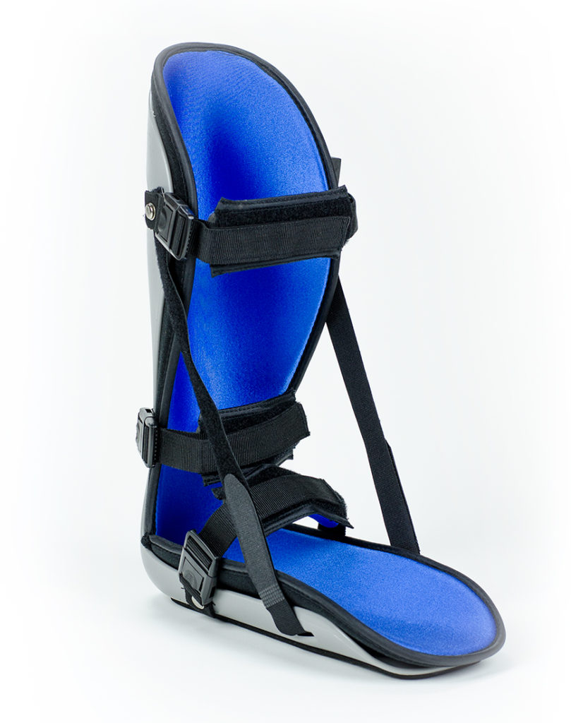
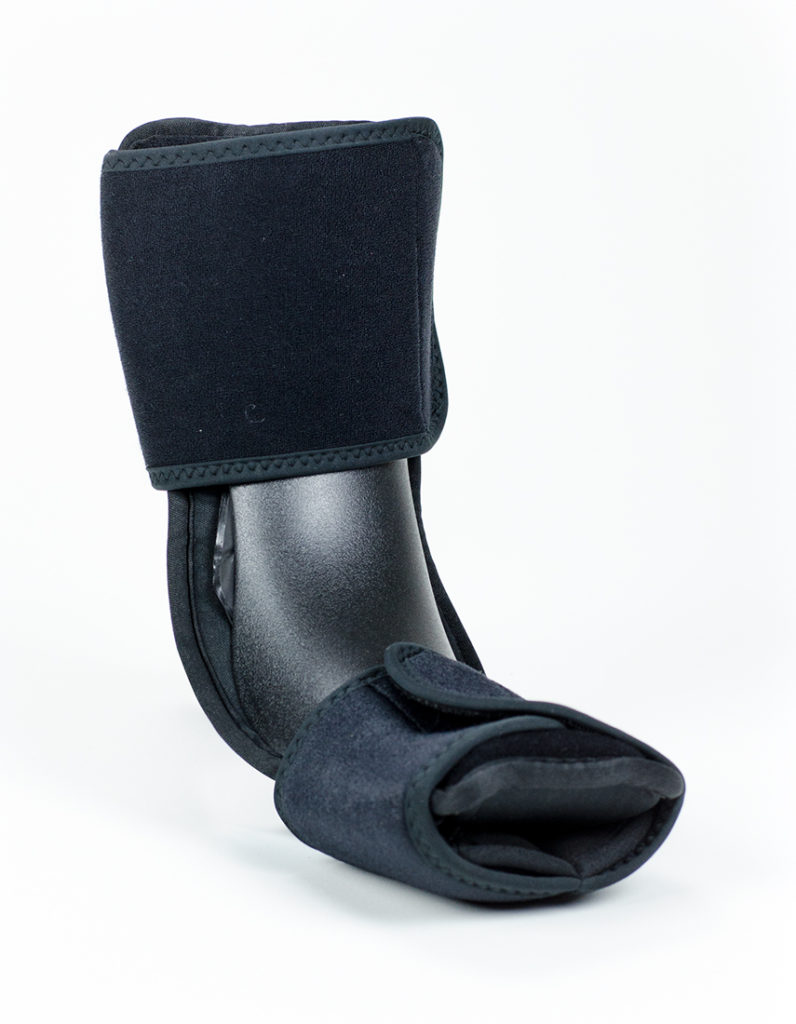
+ Product Photography
+ Sales Flyers
+ Product Catalog
© Global Orthopedic
- Concepting
- Creative Direction
- Design
- Designer
- Photographer
- Storyboard
- Website Development
