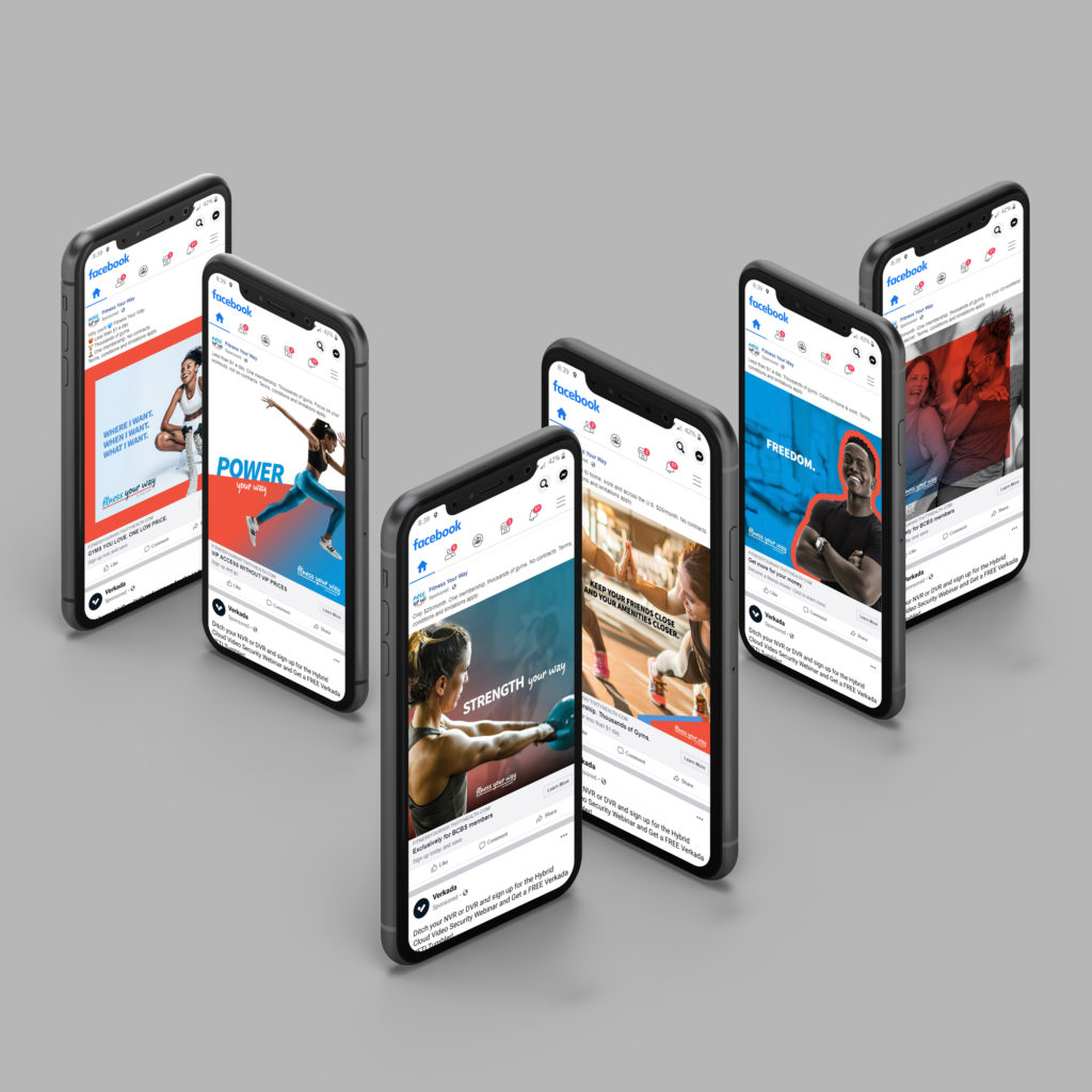
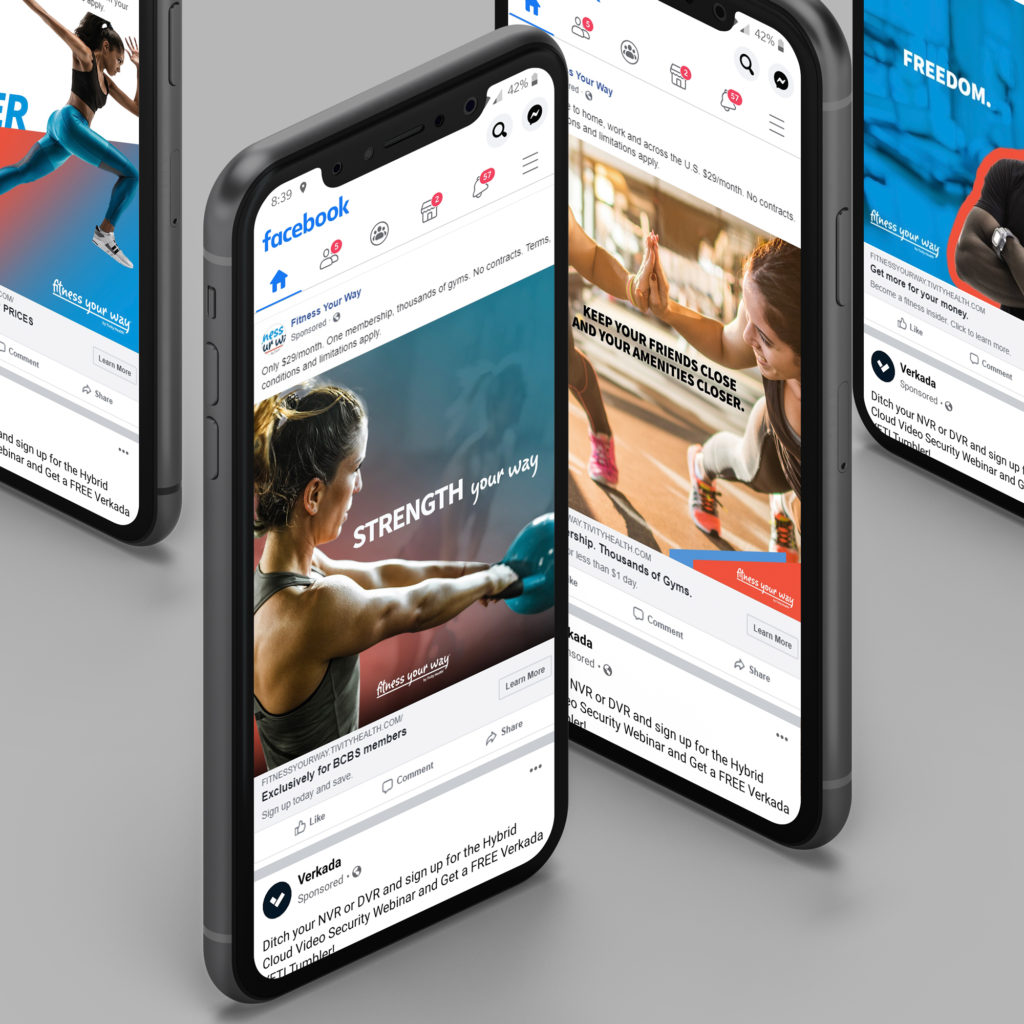
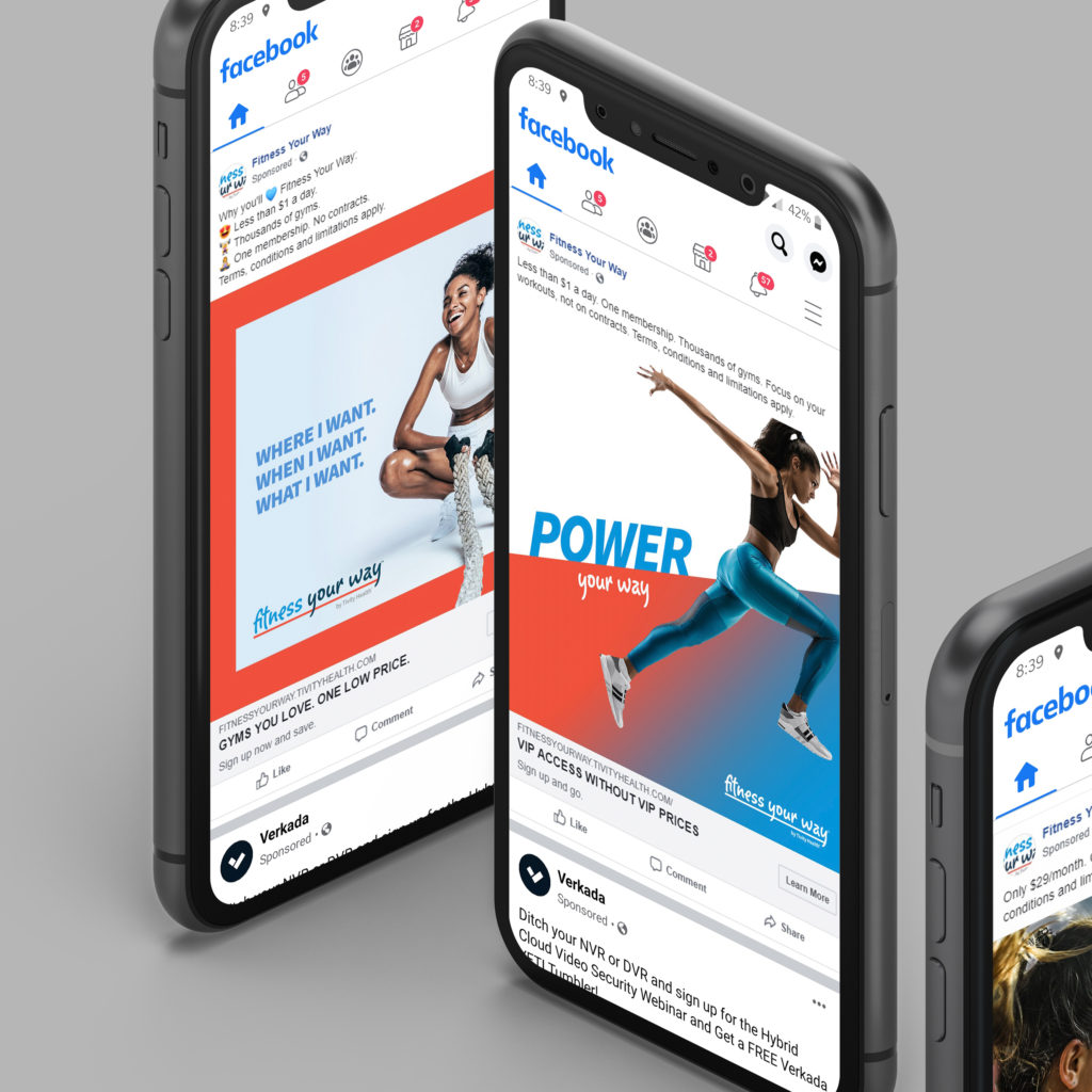
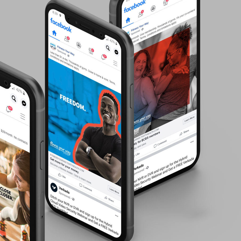
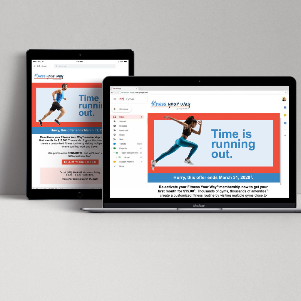
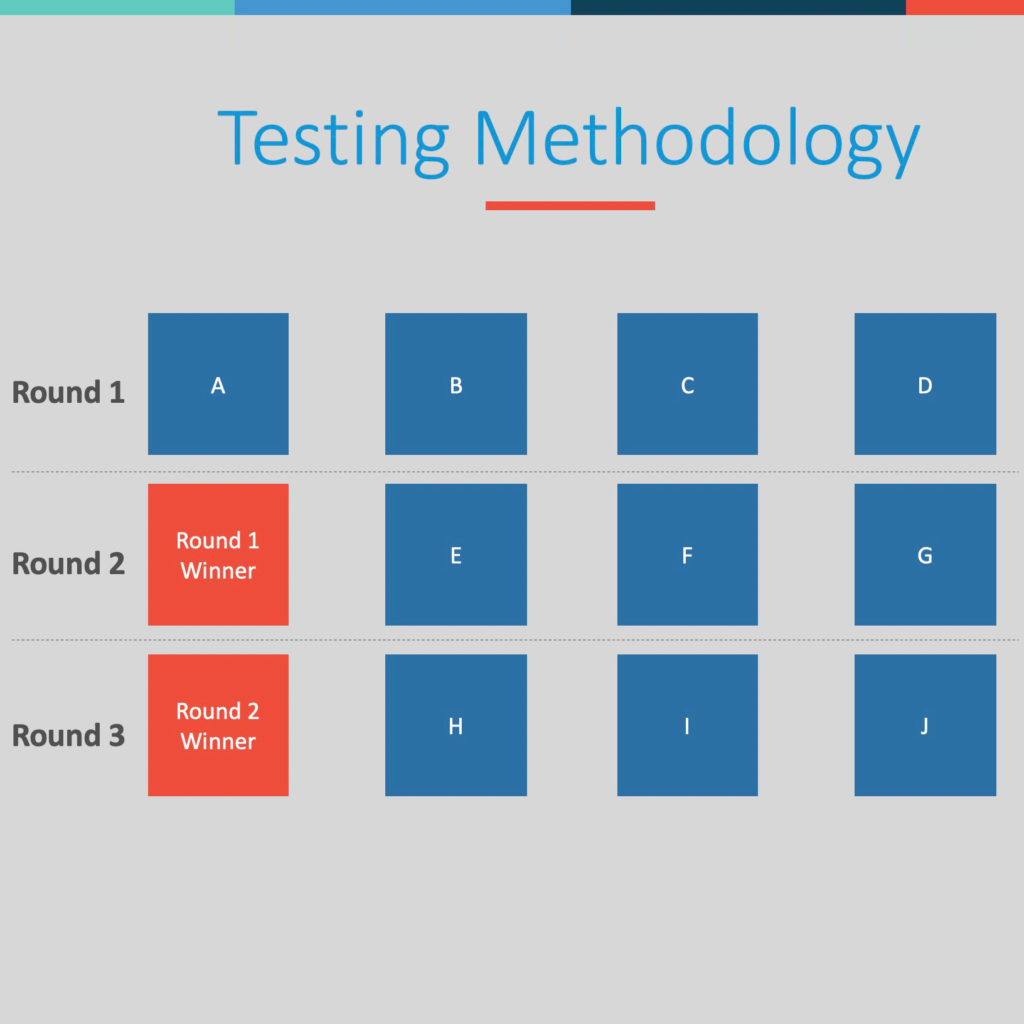
For this monthly paid social promotion offer, we wanted to maximize previous learnings and go all in on testing via Facebook Creative Hub. The goal was to gain a deep understanding of what our consumers were positively reacting to…and help inform the future brand evolution. I developed a simple, yet effective testing matrix that would help sell the idea internally. Essentially, it was a tournament, the winner would move onto the next round, and face 2 new creative options. At the end, we would understand what visuals, headlines, post cop and descriptions were the most effective, thus reducing future paid budget.
Among many insights, we were able to simplify the matrix since we knew static ads previously performed better, so we eliminated animation/video from this testing. We also knew we wanted to test out emoji’s to give a new copy approach. The idea was to test being informal as well as test if something looking like it came from a friend would resonate.
Deliverables:
• 10 Unique Images
• 10 Unique Headlines
• 10 Unique Post Copy
• 10 Unique Descriptions
• Email layouts
© Tivity Health
- Campaign Concept
- Concept Approval
- Concepting
- Creative Direction
- Executive Approval
- Storyboard

