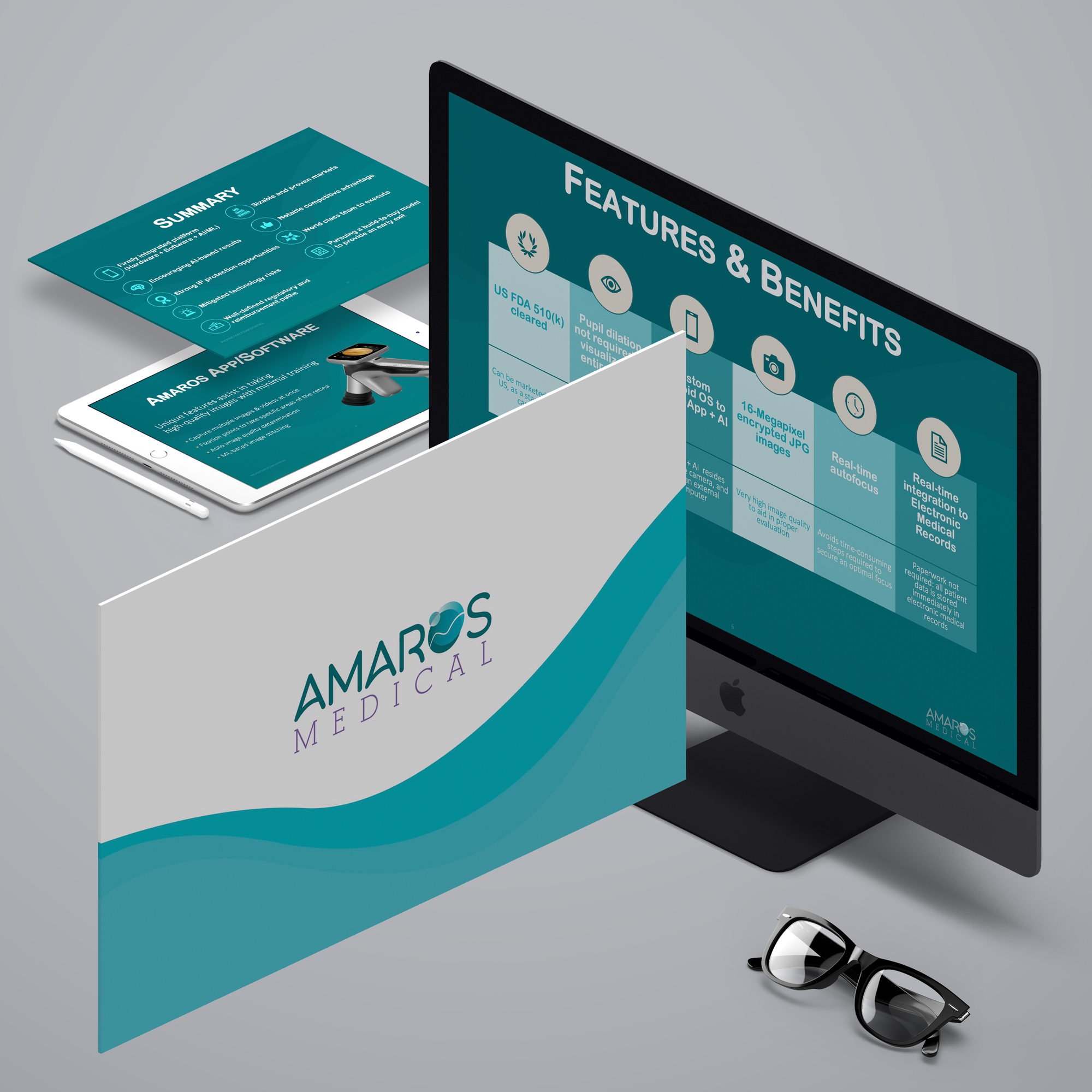
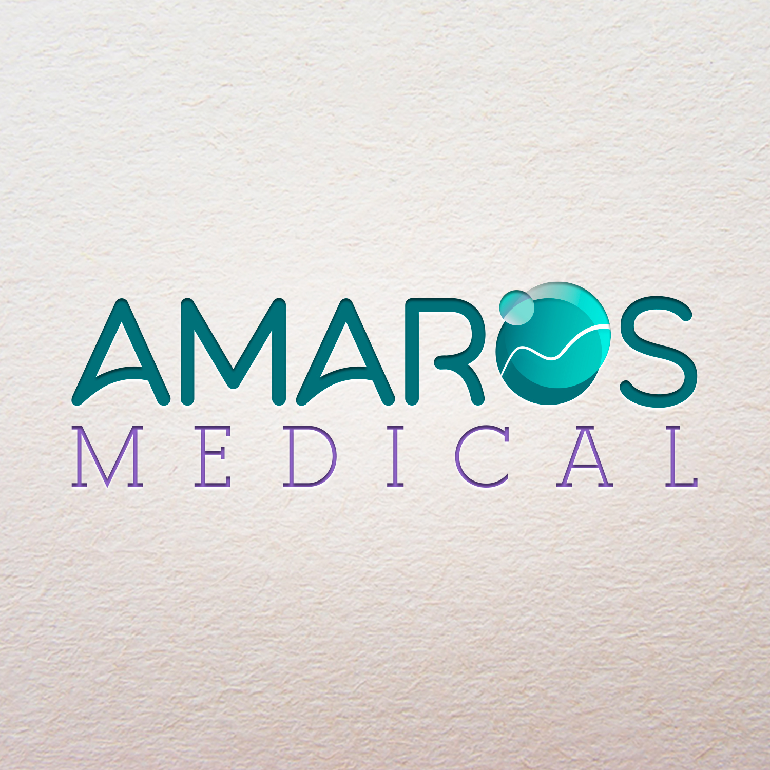
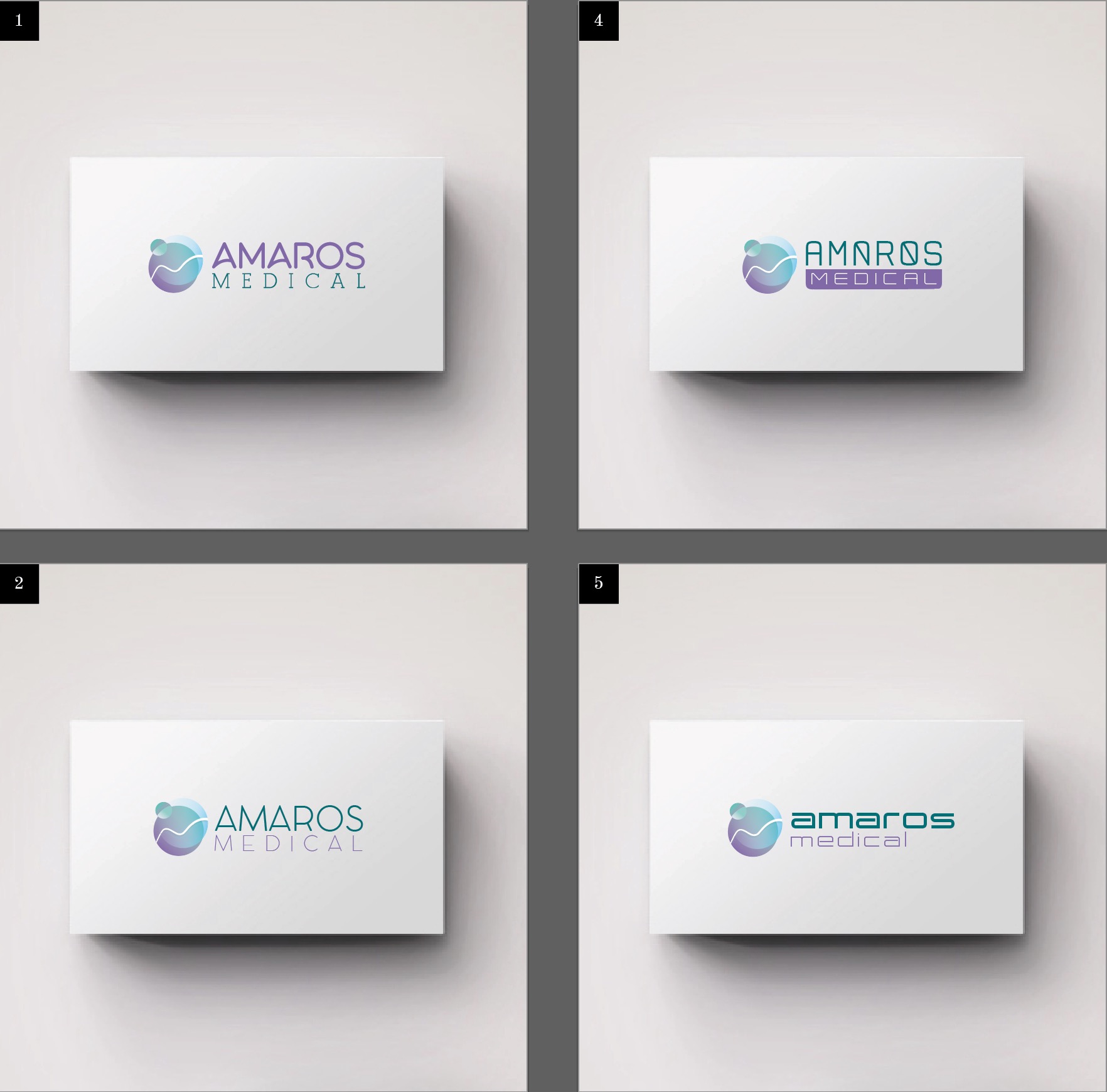
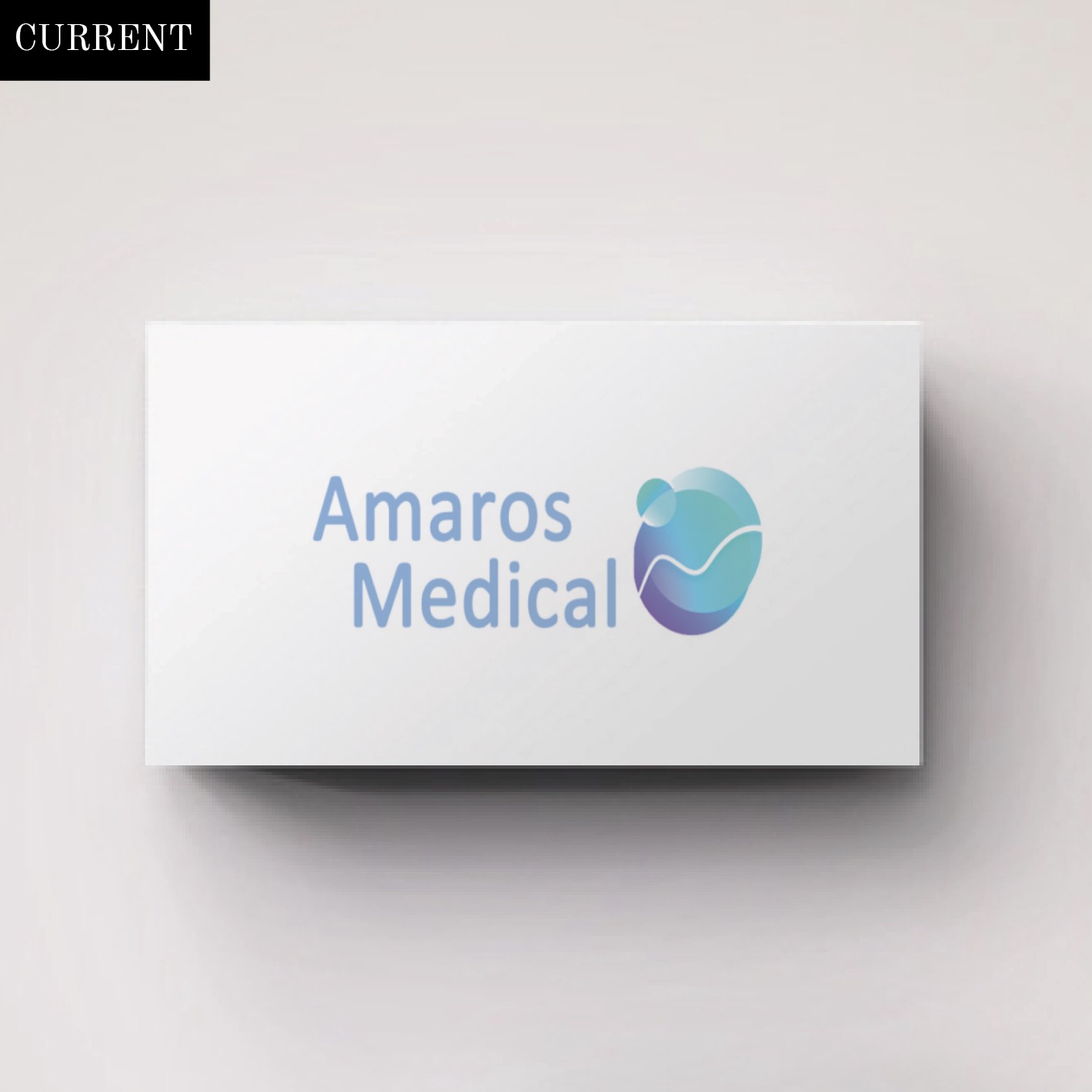
Amaros Medical had an urgent need for an upcoming product presentation and with that they also needed a logo update. Their existing logo style and brand direction was set…they just needed help weaving in a cohesive visual identity. The direction of the logo mark was a literal and directly correlates to the vision industry; an outsider would never know what it represented, but their target audience would. I utilized the previous color and developed a complementary color palette and used the previous color as the accent.
The 27 slide presentation was a typical style executive deck with title page, overviews, features and benefits. Where possible, I broke out the text heavy slides with iconography. Since there was a good chance the presentation was going to be projected, I utilized dark background colors and reversed text which is easier on the eyes. The presentation needed to be edited by non-Creatives, and on both Mac and PCs, so font choice was critical so anyone could evolve the slides as needed.
© Amaros Medical
- Campaign Concept
- Concepting
- Creative Direction
- Design
- Designer
- PPT Design
- Storyboard